4.9 GOOGLE RATING

 USA
USA  Australian
 Logo Statistics, Facts & Design Trends 2025

How Important is an Effective Logo?
A logo is often the first form of communication a company has with their customers. When done right, a good logo effectively embodies the company as a whole, conveying each element of its brand identity, ethos and purpose. In this piece, we identify what makes a good logo design and which features are most regularly used in the logos of the world's largest 250 companies.
Logo Statistics and Design Trends of 2025: The Short Version
Want the quick version? We’ve summed up our key findings here. More in-depth analysis and research can be found further on in the article.
- The colour blue appears the most in the world’s largest 250 companies’ logos, with almost a third (30.8%) of them having blue logos of some kind.
- 81.6% of the 250 largest global companies have two or fewer colours in their logo.
- More than half (55.6%) of logos that use text are fully capitalised.
- Instagram is the most searched for logo, with over 1.2 million monthly searches globally.
What is the Most Effective Logo Colour?
We analysed the logos of the 250 top companies on the Forbes 2000 list to discover which colours, styles and typographies are most commonly used. This analysis enabled us to discover which types of logo designs are used the most and which are the most effective*.
*In this article, we've referred to elements of logos that appear most frequently within the top 250 companies in Forbes' 2000 list as being the most effective. However, it's important to note that just because these elements are used most frequently in the logos featured in this list, this does not necessarily connote efficacy, as each company's success is a consequence of far more than just its logo.
What is the Most Commonly Used Primary Colour?

- Blue is the most commonly used primary colour, with 77 of the world's 250 largest companies using it in their logos. A further 15 companies use turquoise as their predominant logo colour, which is also very close to blue.
- In second place, red features primarily in the logos of 68 companies examined, with a notable example being the iconic Coca-Cola logo.
Blue is frequently adopted for a range of popular brand logos, particularly those in the social networking space - such as Facebook, Twitter and LinkedIn. The common use of this colour can be explained by some schools of thought that believe that:
"Blue is known for its trust and dependability. It's reliable, responsible, and mentally soothing".
On the other hand, red often appears to be used to attract attention and instil a sense of excitement or passion. Think of the aforementioned Coca-Cola logo, as well as the business logos of Netflix and Target. It's also thought to bring a sense of energetic brand recognition, conveying a powerful and active brand image.
How Many Colours Do the Logos Use?
| Number of Colours | Number of Companies Using this Design |
| 1 | 96 |
| 2 | 108 |
| 3 | 35 |
| 4 Or More | 11 |
The majority of logos use a mixture of two colours, with 108 of the 250 adhering to this type of coloured logo design. Examples of companies that use a combination of colours within their logos are FedEx, with its iconic purple and orange font, as well as Vodafone, with its red and white brand logo.
96 of the 250 companies use only one colour, emphasizing the popularity and effectiveness of simplicity in brand logos. The single colour choice includes some of the world's most successful companies, such as Apple, National Grid and Samsung, who use just one colour in their logo, creating a straightforward, memorable icon for their target consumers. Ultimately, branding statistics show that colour improves brand recognition, something which is aided by the use of as few colours as possible. Companies looking to develop strong brand awareness would be wise to ensure that logo colours remain uniform across as many channels as possible, from physical signage and TV advertisements to online ads and social media marketing campaigns.
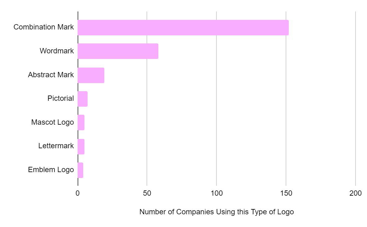
What is the Most Effective Type of Logo?
There are many styles of logos present in the Forbes 250 largest companies list. The most popular of these is the combination mark, which incorporates both text and a picture logo. Our analysis found that 152 of the 250 logo designs examined use this style, with examples including the logos of Mitsubishi, Costco and the Bank of China. Wordmark logos are also popular, used by 58 companies on the list, including Samsung, Sony, Nestlé and IBM.
Even though pictorials and emblems aren't the most popular logo designs amongst the top 250 companies, they are employed by some of the most recognizable brands in the world. These include the Apple logo and the Nike "swoosh".
What is the Most Effective Logo Typography?
The final design aspect we analysed was the typography of the world's largest companies' logos, including the font style and capitalization choices.
Which Font Styles Do the World’s Most Successful Companies Use in Their Logos?
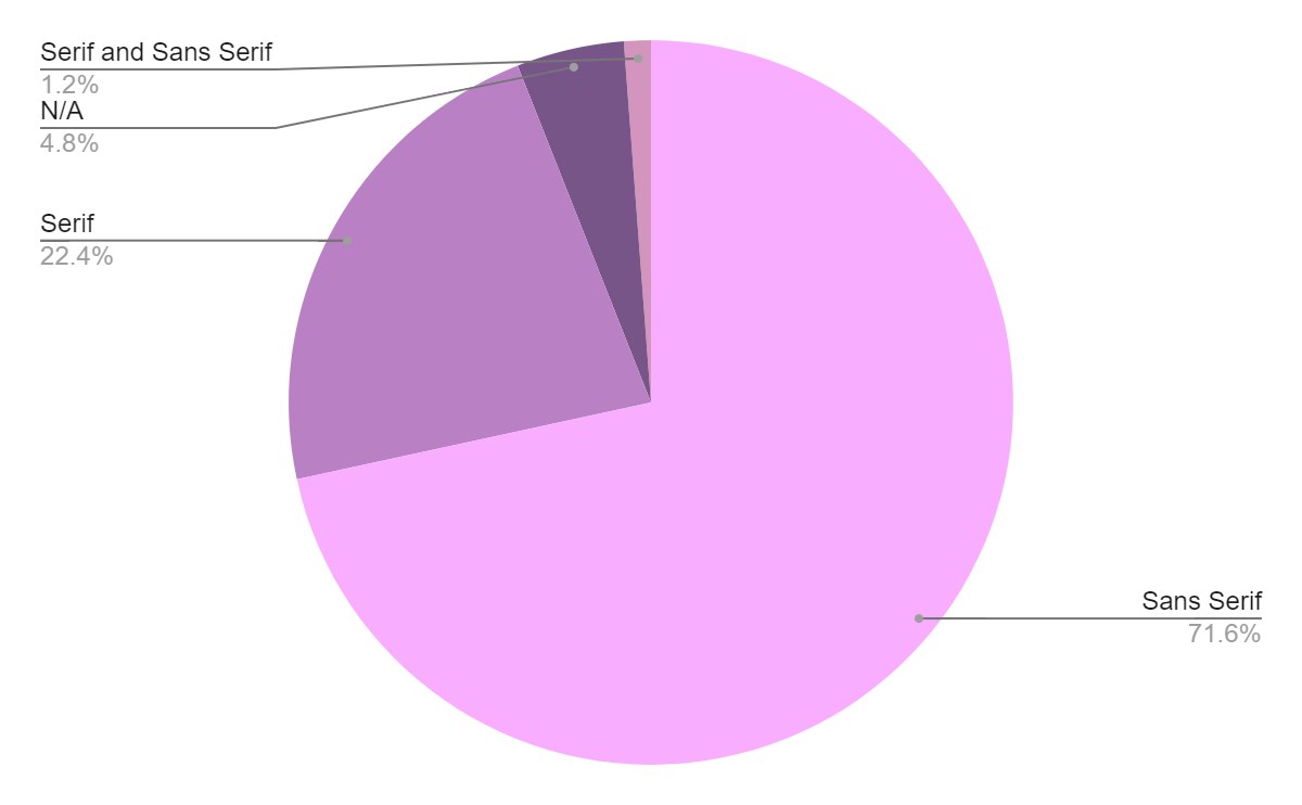
The most popular font style was Sans Serif, with 179 of the 250 largest global public companies utilizing it in their logo branding. This may be due to San Serif's popularity in various sectors, instilling a sense of familiarity amongst potential customers, who may feel more at ease when presented with typography of this kind.
Logos utilizing the Sans Serif font style include Unilever, Nestlé and Hyundai Motor. Although in the minority, the Forbes 250 companies who use the Serif typeface style in their logos include globally recognised brands like IBM, Aviva and Barclays.
Are Capitalised Logos More Successful?

Our analysis found that capitalization of letters is twice as common as using only lowercase lettering, showing this design's popularity and potential effectiveness. When capitalised, logos tend to stand out more, which is one of the primary responsibilities of a logo.
However, interestingly, a handful of some of the world's most widely recognizable brands, such as Facebook and Intel, have chosen to adopt lowercase logos. Well-designed wordmark logos often focus on pure simplicity, with the majority of brands steering away from using both capitalised and lowercase styling.
The UK's Attitudes Towards Logos in 2025
So now we know more about what makes a logo successful. But what does the general population think when it comes to logos? Are people more likely to trust a brand if they recognise a logo? To find out, we surveyed 2,000 UK adults, asking them to select which of the following statements were true for them:
- I often recognise the logos of big brands
- I often recognise the logos of businesses I like
- I am likelier to trust a business if its branding/logo is familiar to me
- I am likelier to buy from a business if its branding/logo is familiar to me
- None of the above
Logo Design Statistics: Do Brands' Logos Influence Consumer Behaviour?
The short answer here is yes!
Our survey found that 26% of UK adults are more likely to trust a business if its branding or logo is familiar to them, and as we know, consumer trust is one of the most integral parts of building a successful brand.
But are consumers more likely to buy from businesses whose logos they recognise?
Well, our survey revealed that 1 in every 4 UK adults (25%) are more likely to buy from a business whose branding or logo is familiar to them.
![]()
Attitudes Towards Logos in Men vs Women
So it's quite clear that the appearance of a brand influences a significant proportion of UK consumers’ habits. But how does this differ between men and women?
It turns out that logos appear to matter more to women than men when it comes to trust and likelihood of making a purchase.
Our survey found that:
- Nearly a third (29%) of women say that they’re more likely to trust a business if its branding/logo is familiar to them, whereas just 23% of men say the same.
- More women than men surveyed (26% vs. 24%) also said that they’re more likely to buy from a brand whose logo is familiar to them.

Importance of Logos by Age Group
When analysing the data from our survey, we also looked at the age of each participant we surveyed to discover whether or not there were any differences or patterns when it comes to how our age influences our attitudes towards logos.
It turns out that:
- The age group that knows their logos best is 45-54 year-olds, as more than half (54%) of this age group says they often recognise the logos of big brands.
- This is then followed by 35-44 year-olds (47%), those aged 55+ (45%), those aged 25-34 (41%) and finally 16-24 year-olds (40.5%).
- When it comes to the likelihood of trusting or buying from brands whose logos we recognise, it’s bar far the youngest members of the British public, as more people aged 16-24 say that a brand’s logo influences how likely they are to trust or buy from them.
- The least easily influenced age groups when it comes to brand logos are those aged 45-54 and 55+, as fewer people in this age group say that a brand’s logo impacts their likelihood of trusting or purchasing from them.
Exciting Logo Trends
Asymmetry
Our research found that 66.8% (or just over 2/3) of the logos representing the top 250 companies are asymmetrical, indicating a preference for this element of design. These results stand in direct opposition to the commonly held 'golden rule' of design that outlines a preference for symmetry amongst the public. One such explanation of this preference for asymmetry is that businesses have evolved beyond the best practices of design in order to stand out from the competition, utilizing their company logo in order to communicate a new and exciting brand identity.
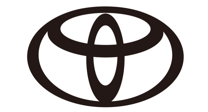
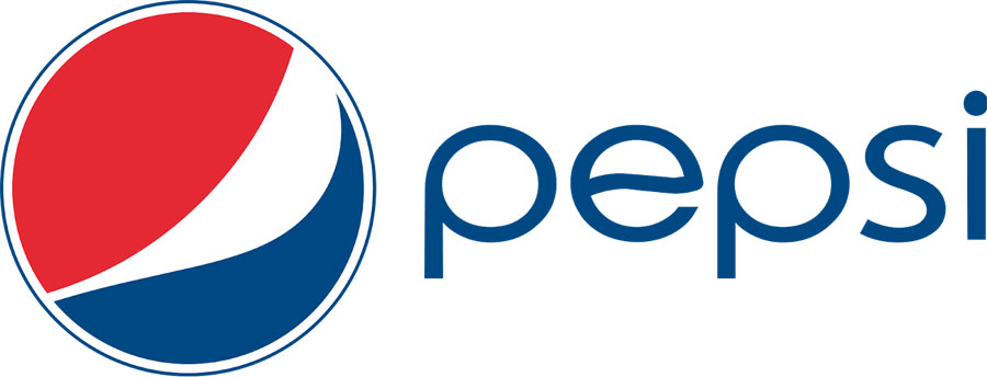
Major examples of symmetrical logos include Walmart, Toyota, BMW, and Deutsche Telekom, businesses which all boast a long-running history and established roots within their chosen markets. Symmetrical logo design, whilst not often considered exciting or trendy, can do a great job of communicating reliability to consumers, making it an ideal choice for businesses looking to present a stable image. On the other hand, businesses looking to communicate an exciting, trendy, and imaginative personality appear to benefit best from asymmetrical logos. Businesses such as Facebook, Nike, and PepsiCo all serve as prime examples of businesses looking to present an exciting and youthful persona through their unique logo designs.
These statistics clearly indicate a trend towards asymmetry in logo design, particularly as major businesses look to further boost brand awareness. This logo design trend has become a staple in the graphic design world, particularly for those looking to create logos that illustrate new beginnings for tried and true brands looking to present themselves in a different light moving forward.
Hidden Quirks
Logo designers often look to include hidden quirks within their designs, many of which serve as a wink and nod to the brand's image or history. Whilst perceived by many to be a simple smile, the Amazon logo also doubles as an arrow pointing from A to Z within the logo, representing the breadth of products available on the website and serving to enforce the overall brand message.
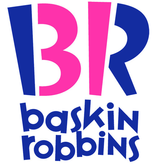
Whilst not a part of the Forbes list measured in our study, the logo of Baskin-Robbins also presents a great example of this logo trend in action. Long famous for their 31 flavours, the current Baskin-Robbins logo features the number 31 accented in pink within the letters 'BR'. This type of branding strategy helps to set businesses apart from their competitors and creates a sense of discovery for engaged consumers by hiding elements of the brand identity within the logo design.
Dynamic Designs
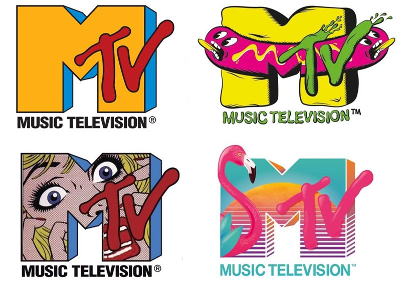
Dynamic logos have opened the door to more unique variations of iconic logo designs, with major brands such as MTV regularly adapting the colouring of their company logo to suit a chosen mood. These dynamic designs, often implemented in conjunction with special events, seasonal trends or collaborative endeavours, allow businesses to alter their brand's logo in order to send a message to target audiences.
The logo featured on Google's homepage is frequently changed to celebrate festive occasions and notable events, with some redesigns even featuring interactable elements. These Google doodles are often sourced from the wider Google community, providing an added element of interaction with users by giving them ownership over new logo designs and branding efforts. This strategy is best employed by businesses with high levels of brand name recognition. However, it would be wise for small businesses to ensure that their logo is versatile enough to be effectively scaled depending on requirements.
Optimised for Mobile
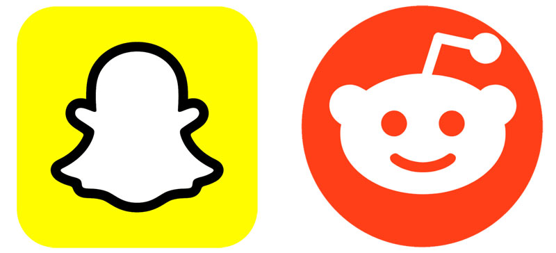
Technology has always played a major role in logo design, dating as far back as the introduction of colour television and the subsequent boom of colourful designs. The continued proliferation of mobile devices across the world and the limited real estate provided for each app on a smartphone's home screen has necessitated that businesses optimise their logos for mobile viewing. App badges often rely on simple icons, as opposed to text, to draw the eye of the user and entice them to use the app. This reality has meant that a lot of businesses have worked to build brand recognition based around a small icon (think the iconic Snapchat ghost or Reddit's alien) that stands out from the crowd.
Which are the Most Recognizable Logos in the World?
Our above survey found that 45% of UK adults often recognise the logos of big brands and a further 35% often recognise the logos of brands they like. So, which brand logos are the most recognizable?
To find out, we conducted a keyword analysis with the keyword tool KWFinder to discover which logos are searched for most often globally. In this analysis, we worked on the basis that if a logo is searched for more frequently, it is more likely to be used and, therefore, is more recognisable.
- We found that the most searched for logo globally is Instagram, with over 1 million searches per month worldwide.
- YouTube and Facebook logos are the second and third most searched logos in the world.
- Followed by Apple, WhatsApp, Nike and Amazon.
We expect that one of the primary reasons for such high search volumes surrounding logos of social media brands may be due to businesses' frequent use of these logos to advertise their social channels.
Want More Fun Logo Facts and Figures? Here You Go!
- Stella Artois has had the same logo for over 656 years since they were founded in the city of Leuven, Belgium, in 1366.
- Disney changes their logo for each film they create - During the opening credits of Toy Story in 1995, the Disney logo was altered slightly to a style more in-keeping with the animated design of the film. After a very positive reaction from Disney’s fanbase, they decided to change the style of every film made thereafter to match the context of each film.
- Ever wondered where the idea of a mermaid on the Starbucks logo came from? Well, this emblem was actually inspired by the myth of the fairy Melusine, who was part woman, part fish and had two tails, which can both still be seen today on the coffee chain’s logo.
- Cadbury, Kellogg’s and Disney’s logos all feature the signature of their founders William Cadbury, William Keith Kellogg and Walt Disney!
Summary: Logo Statistics Roundup 2025
Our analysis has found a wide range of similarities between the logos of some of the world's most successful companies. However, what's also clear is that many of the world's most successful, dominating brands do not follow a specific formula. There doesn't appear to be a 'one-size-fits-all' model when it comes to branding and communicating with your customer base.
Although, if you're in the process of setting up a business and looking to create a logo, opting for a primarily blue theme, that incorporates a secondary colour, capitalised letters and uses a combination style of both text and an emblem may lead you onto a winner!
Either way, we wish you the best of luck with all of your logo endeavours and hope this piece has been insightful!
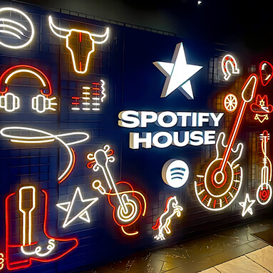
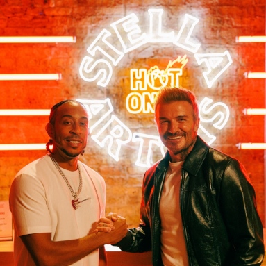
P.s - if you're looking for an excellent way to show off your business' logo, social media channel or branded artwork, check out our bespoke LED Neon Business Signs!
To find out more about our research or request an interview:
Get in touch with our Media & Outreach team now by contacting
Clare Jones
Global Outreach Manager
Email: clare@customneon.com
LinkedIn: Clare Jones
All product names, logos, and brands are the property of their respective owners. All company, product, and service names used in this website are for identification purposes only.
More research commissioned or undertaken by Custom Neon® can be found by clicking the following links: